- Published on
Iosevka (v34.9.0): The Code-Generated, Ultra-Customizable Monospace Font
- Authors

- Name
- Hoang Nguyen
👤 1. Who Is Involved & Impacted?
- Creator & Maintainer: Belleve Invis (
be5invis/ Renzhi), who has continuously engineered and maintained Iosevka since 2015 as an open-source (SIL Open Font License 1.1) programmatic typeface family. - Classic & Commercial Font Rivals: Competes with popular free coding fonts (JetBrains Mono, Fira Code, Cascadia Code, Hack, Maple Mono, Commit Mono) and premium commercial programmer typefaces (PragmataPro and
$225Berkeley Mono). - Target Audience: Terminal power users (
tmux, Neovim, Emacs, Alacritty/Ghostty/Kitty), split-pane IDE developers, and technical writers who mix code, ASCII tables, and CJK characters.
📦 2. What Is Iosevka (v34.9.0)?
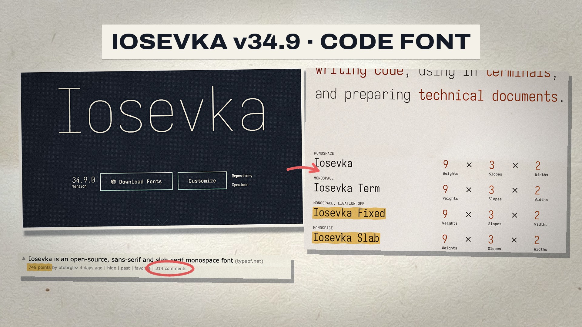
Iosevka (typeof.net/Iosevka) is a slender, open-source sans-serif and slab-serif monospace (and quasi-proportional) typeface family built entirely from mathematical source code (🔤 a crisp narrow monospace 'Aa' glyph icon):
- 100% Code-Generated via
PatEL: Instead of hand-drawing Bezier curves in FontForge or Glyphs, every glyph in Iosevka is written as a parametric program in PatEL (Parametric Type Expression Language)—allowing automatic synthesis across 9 weights (ThintoHeavy) 3 slopes (Upright,Italic,Oblique) 2 widths (Normal&Extended). - Ultra-Compact
1/2emDefault Cell Width: In its defaultNormalwidth, Latin characters occupy exactly half an em (0.5em) while CJK ideographs occupy one full em (1.0em)—fitting significantly more horizontal columns per screen and keeping CJK + ASCII terminal tables perfectly aligned. - 6 Packaged Sub-Families: Ships in Monospace (
Iosevka,Iosevka Term,Iosevka Fixedwithout ligatures), Slab-Serif (Iosevka Slab,Term Slab,Fixed Slab), and Quasi-Proportional (Iosevka AileandIosevka Etoilefor prose/UI). - 146 Character Variants & 19 Stylistic Sets (
ss01–ss20): Allows developers to toggle individual glyph shapes (a,g,0,@,*) or activate complete one-flag presets emulating Andale Mono (ss01), Consolas (ss03), Menlo (ss04), Fira Mono (ss05), PragmataPro (ss08), or JetBrains Mono (ss14), plus language-specific ligature sets (calt,dlig).
📅 3. When & Where?
- When: Highlighted on Hacker News on October 14–15, 2026 alongside the v34.9.0 release cycle, celebrating over a decade of continuous parametric font engineering.
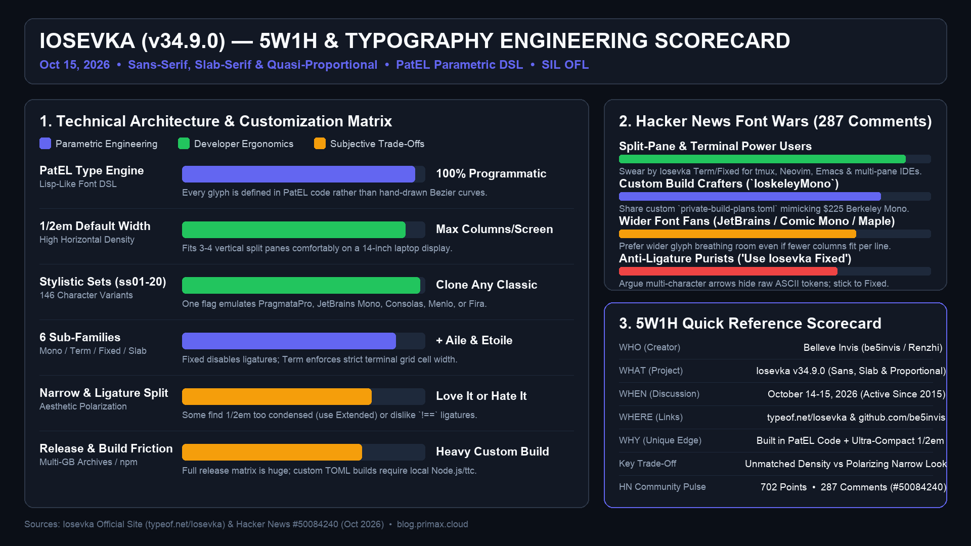
- Where: Interactive specimen and visual customizer hosted at typeof.net/Iosevka/ with source code at github.com/be5invis/Iosevka, drawing 702 points and 287 comments on Hacker News (#50084240).
🎯 4. Why Do Developers Obsess Over Iosevka?
- Unmatched Horizontal Screen Density: On 13-to-16-inch laptop screens—or when running 3–4 vertical split panes alongside an AI coding sidebar—standard wide fonts wrap at 80 columns, whereas Iosevka's
1/2emwidth comfortably fits 100–120 columns per pane. - "Compile Your Own Font" Culture (
private-build-plans.toml): Because Iosevka is code, developers version-control their ownprivate-build-plans.tomlfiles in their dotfiles—even spawning popular community forks likeIoskeleyMono(configuring Iosevka to mirror the aesthetic of Berkeley Mono for free).
⚙️ 5. How Did the Hacker News Font Debate Split?
The 287-comment Hacker News thread proved that programmer typography remains deeply personal:
- The Terminal & Split-Pane Devotees (
wartywhoa23,TwoFerMaggie,cik,needfish): PraisedIosevka TermandIosevka Fixed Slabas irreplaceable daily drivers for high-DPI Linux/macOS terminals, praising its razor-sharp punctuation, distinct1/l/Iand0/Odisambiguation, and mathematical consistency. - The "Too Narrow / Cramped" Critics (
jve,slazaro,Daneel_): Found the default1/2emwidth claustrophobic and harder to scan quickly than wider faces like JetBrains Mono, Cascadia, or Comic Mono (though supporters noted switching toIosevka Extendedimmediately widens the cell). - The Ligature & Build-Size Skeptics (
goatking,bayindirh): Debated programming ligatures (converting!=or-->into single glyphs, whichIosevka Fixeddisables by default) and noted that the Combinatorial explosion of prebuilt weights/variants makes GitHub release archives massive—requiring a local Node.js/npmbuild if you want a custom TOML variant.
✅ CONCLUSION
Iosevka is a free, extremely customizable, and space-saving coding font, but choosing a font is a matter of personal taste: its narrow width and ligatures are both its biggest strengths and its main points of controversy.